Hi! Today I have come up with some really cool and easy Drop Cap Effects using CSS. You can straight away copy paste the styles and use it, no tweaks required. Earlier we have tried some cool image effects. This time we are going to style the drop caps with few lines of CSS code. Drop cap is a large character at the start of an artilce, section or paragraph which is very common on publishing medias. We’ll take full advantage of CSS text-shadow property to style the drop caps. Come, let’s start exploring.
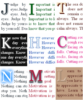
How to Create Drop Cap using CSS?
We can create a simple drop cap effect with first-child and first-letter pseudo elements.
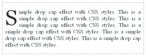
The HTML markup consists of no special code. Just we wrap a set of <p> tags within a <div> block. We want only the first line, first character to be a DROP CAP letter.
We’ll add some basic CSS code to the <div> block to reset the default styles.
CSS Codediv {
margin: 0;
padding: 0;
border: 1px dashed #666; /* set to none if you don't want border */
font-family: Georgia;
font-size: 20px;
background: #FFF;
color: #3B444B;
text-align: justify;
}
p:first-child:first-letter {
float: left;
color: #333;
font-size: 75px;
line-height: 60px;
padding: 5px 5px 0 0;
}
HTML Markup
<div>
     <p>Simple drop cap effect with CSS styles. </p>
     <p>This is the second paragraph. </p>
     <p>This is the third paragraph. </p>
</div>
Only the first <p> tag’s first character “S” will be a drop cap.
The HTML Markup would be of no difference for the rest of the styles we are going to discuss so I’ll give only the CSS styles for them.
Drop Cap with Border
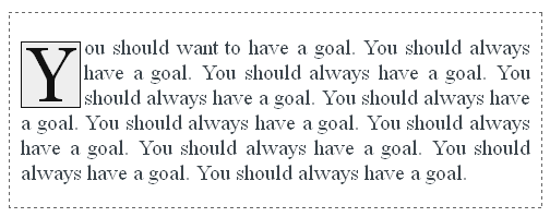
To the above drop cap, we add some background color and a suitable border to make it more appealing.
div {
     margin: 0;
     padding: 0;
     border: 1px dashed #666; /* set to none if you don't want border */
     font-family: Georgia;
     font-size: 20px;
     background: #FFF;
     color: #3B444B;
     text-align: justify;
     }

p:first-child:first-letter {
     float: left;
     background: #EEE;
     color: #111;
     margin: 6px 3px 0 0;
     padding: 5px;
     font-size: 70px;
     line-height: 60px;
     border: 1px solid #111;
}
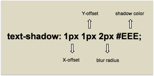
Next we start with text-shadow property which comes in handy to spice up our drop caps with shadows. With the clever usage of shadows we can pull off amazing text effects. Here, take a little sneak peak at the text shadow property.
Drop Cap Effects with Single Shadow
These styles add a single shadow to the text to create a simple yet elegant drop cap effects.
Classic Drop Cap
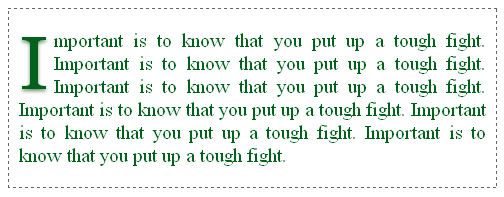
The idea behind this style is to add a shadow with a shade lighter than the text with little bit blur radius. You can change the text and shadow color but make sure you use shades from the same color group (I have used green shade in the example).
CSS Code
div {
     margin: 0;
     padding: 0;
     border: 1px dashed #666;
     font-family: Georgia;
     font-size: 20px;
     background: #FFF;
     color: #00611C;
     text-align: justify;
}

p:first-child:first-letter {
     float: left;
     color: #00611C;
     font-size: 75px;
     line-height: 60px;
     padding: 8px 6px 0 0;
     text-shadow: 0 2px 3px #698B69;
}
Glowing Drop Cap
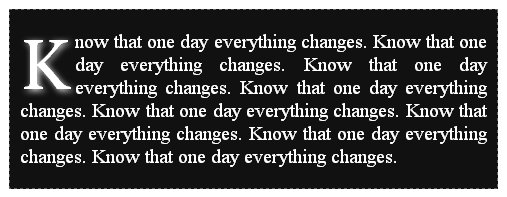
This style makes the drop cap to glow. Here we should use lighter shade text against dark background.
CSS Code
div {
     margin: 0;
     padding: 0;
     border: 1px dashed #666;
     font-family: Georgia;
     font-size: 20px;
     background: #111;
     color: #FFF;
     text-align: justify;
}

p:first-child:first-letter {
     float: left;
     padding: 10px 6px 0 0;
     background: #111;
     color: #FFF;
     font-size: 70px;
     line-height: 60px;
     text-shadow: 2px 2px 6px #eee;
}
Stand Out Drop Cap
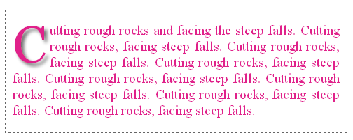
This style gives an effect as though the drop cap stands out of the background frame. Now you can understand how much we can accomplish with text-shadow property. You can change the text color of your choice.
CSS Code
div {
     margin: 0;
     padding: 0;
     border: 1px dashed #666;
     font-family: Georgia;
     font-size: 20px;
     background: #FFF;
     color: #E0218A;
     text-align: justify;
}

p:first-child:first-letter {
     float: left;
     color: #E0218A;
     padding: 5px 5px 5px 0;
     font-size: 75px;
     line-height: 60px;
     text-shadow: 4px 4px 4px #666;
}
Drop Cap Effects with Double Shadow
We now try some styles using double shadows.
A Classic Double Shaded Drop Cap
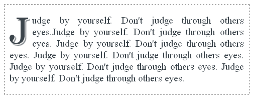
This style makes a wise usage of two shadows with a 1px of blur to smooth the contours of the text and gives a well rounded look to the drop cap.
CSS Code
div {
     margin: 0;
     padding: 0;
     border: 1px dashed #666;
     font-family: Georgia;
     font-size: 20px;
     background: #FFF;
     color: #3B444B;
     text-align: justify;
}

p:first-child:first-letter {
     float: left;
     color: #3B444B;
     font-size: 75px;
     line-height: 60px;
     padding: 6px 6px 0 0;
     text-shadow: 2px 2px 1px #EEE,
     3px 3px 1px #3B444B;
}
Embossed Drop Cap
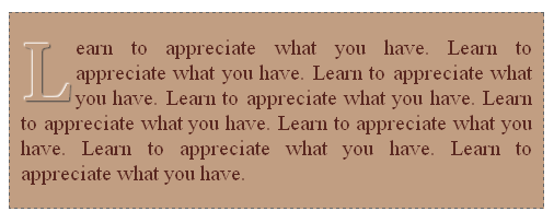
Always we have awe for embossed text which looks like a bump in the background surface. With the right choice of colors we can bring up this look using text-shadow property. Note that we should use the same color for both text and background.
CSS Codediv {
margin: 0;
padding: 0;
border: 1px dashed #666;
font-family: Georgia;
font-size: 20px;
background: #C19E82;
color: #592720;
text-align: justify;
}
p:first-child:first-letter {
float: left;
background: #C19E82;
color: #C19E82;
padding: 8px 5px 5px 0;
font-size: 75px;
line-height: 60px;
text-shadow: -1px -1px 1px #fff,
1px 1px 1px #444;
}
Drop Cap Effects with Multiple Shadows
Next we see some drop cap effects produced by using multiple text shadows.
3D Drop Cap
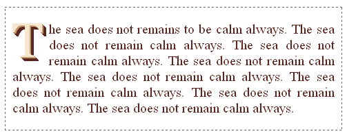
This is an interesting 3D style drop cap. The idea is to choose a lighter shade for the text and add multiple shadows to the text with two different colors, one a bit darker and the second one much darker than the text.
CSS Code
div {
     margin: 0;
     padding: 0;
     border: 1px dashed #666;
     font-family: Georgia;
     font-size: 20px;
     background: #FFF;
     color: #592720;
     text-align: justify;
}

p:first-child:first-letter {
     float: left;
     color: #F7E7CE;
     padding: 3px 10px 5px 0;
     font-size: 70px;
     line-height: 60px;
     text-shadow: 1px 1px 0 #C19A6B,
     2px 2px 0 #C19A6B,
     3px 3px 0 #592720,
     4px 4px 0 #592720,
     5px 5px 0 #592720,
     6px 6px 0 #592720;
}
Smoky Drop Cap
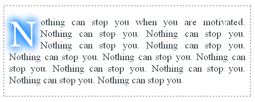
This is a drop cap style that looks like as though you dragged a finger on a smoky glass window. This is one of the best examples of using shadows to spread a color on all the four directions of a text to make a smudge/smoky appearance. Note that we should use the same color for text and background to get the desired effect.
CSS Code
div {
     margin: 0;
     padding: 0;
     border: 1px dashed #666;
     font-family: Georgia;
     font-size: 20px;
     background: #FFF;
     color: #3B444B;
     text-align: justify;
}

p:first-child:first-letter {
     float: left;
     color: #FFF;
     margin: 6px 3px 0 0;
     padding: 5px 5px 5px 0;
     font-size: 70px;
     line-height: 60px;
     text-shadow: 2px 2px 16px #007FFF,
     -2px -2px 16px #007FFF,
     -2px 2px 16px #007FFF,
     2px -2px 16px #007FFF;
}
Hollow Outlined Drop Cap
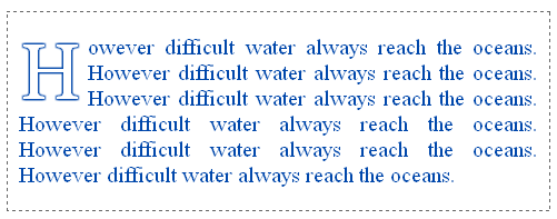
This is one of my favorite text effects which create a complete outlined text. In order to make a hollowed drop cap, set the same background color to the drop cap.
CSS Code
div {
     margin: 0;
     padding: 0;
     border: 1px dashed #666;
     font-family: Georgia;
     font-size: 20px;
     background: #FFF;
     color: #0047AB;
     text-align: justify;
}

p:first-child:first-letter {
     float: left;
     color: #FFF;
     padding: 8px 5px 5px 0;
     font-size: 70px;
     line-height: 60px;
     text-shadow: 1px 1px 1px #0047AB,
     -1px -1px 1px #0047AB,
     -1px 1px 1px #0047AB,
     1px -1px 1px #0047AB;
}
Another 3D Style Drop Cap
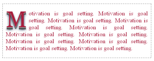
Here we go with another 3D style drop cap where we use consecutive darker shades of grey to produce the effect. Of course the text color could be anything of your choice, but it would be more appealing if you stick to stronger shades.
CSS Code
div {
     margin: 0;
     padding: 0;
     border: 1px dashed #666;
     font-family: Georgia;
     font-size: 20px;
     background: #FFF;
     color: #A9203E;
     text-align: justify;
}

p:first-child:first-letter {
     float: left;
     color: #A9203E;
     padding: 5px 5px 10px 0;
     font-size: 75px;
     line-height: 60px;
     text-shadow: 0 1px 0 #999,
     0px 2px 0 #888,
     0px 3px 0 #777,
     0px 4px 0 #666,
     0px 5px 0 #555,
     0px 6px 0 #444,
     0px 7px 0 #333,
     0px 8px 7px #001114;
}
Recommended Read: How to add Photo Frame Effect to Images using pure CSS
Final Thought
For older browsers, you can apply the above discussed styles to <span> tag and then wrap the required drop cap letter inside the <span> like below.
<div>
     <p><span>S</span>imple drop cap effect with CSS styles. </p>
     <p>This is the second paragraph. </p>
     <p>This is the third paragraph. </p>
</div>
There is no limitation to the text effects we can bring up with CSS3. Just I tried to apply some of those effects to drop caps. Now it’s your call to explore it:). Please don't forget to subscribe to our RSS feed to learn more quality CSS tutorials like this.

I appreciate the effort of the blogger. I have one small question which is related to html5. If you could help me out then it would be really helpful. How is the page structure in html5 is different from html4?
ReplyDeletehtml5 training in chennai|html5 course in chennai
Thanks for sharing this post with us it is a worth read HTML5 Training in Chennai
ReplyDelete