Twitter Bootstrap provides Navbar component which is responsive in nature and can be used to serve as navigation menu for your web application or site. These navbars are collapsed and toggleable in mobile devices and stretch out horizontally for wider viewport. Bootstrap Navbar is available in two different themes, "navbar-default" for lighter shade and "navbar-inverse" for darker theme. However you need not always stick to what comes as default with bootstrap and can extend its functionality to suit your need.
Customize Twitter Bootstrap Navbar
Customizing the existing bootstrap navbar style is one thing which you can learn in this article. But this bootstrap navbar tutorial will teach you how to create your own navbar element from scratch. Flat design is pretty popular so we'll try creating one here.
Create Flat Style Navbar in Bootstrap
Follow these simple steps to create your own navbar element in bootstrap for your next project.
Step-1: First create an html file and load bootstrap and jquery library. Load the css inside the <head></head> section and javascript files just above the closing body tag (</body>).
<html>
    <head>
        <meta name="viewport" content="width=device-width, initial-scale=1.0">
        <link href="/path/to/bootstrap.css" rel="stylesheet" type="text/css" />
    </head>
<body>

    ...

    <script src="/path/to/jquery-1.10.2.js" type="text/javascript"></script>
    <script src="/path/to/bootstrap.js" type="text/javascript"></script>
</body>
</html>
Step-2: Next create a new css style sheet "custom.css" and load it after the bootstrap css file.
<head>
    ...
    <link href="/path/to/bootstrap.css" rel="stylesheet" type="text/css" />
    <link href="/path/to/custom.css" rel="stylesheet" type="text/css" />
</head>
Step-3: Then add the following css code to the "custom.css" and save the file.
.navbar {
    border-radius: 0;
}

.navbar-new {
    background-color: #23BAB5;
    border-color: #0FA6A1;
}

.navbar-new .navbar-brand,
.navbar-new .navbar-brand:hover,
.navbar-new .navbar-brand:focus {
    color: #FFF;
}

.navbar-new .navbar-nav > li > a {
    color: #FFF;
}

.navbar-new .navbar-nav > li > a:hover,
.navbar-new .navbar-nav > li > a:focus {
    background-color: #0FA6A1;
}

.navbar-new .navbar-nav > .active > a,
.navbar-new .navbar-nav > .active > a:hover,
.navbar-new .navbar-nav > .active > a:focus {
    color: #FFF;
    background-color: #0FA6A1;
}

.navbar-new .navbar-text {
    color: #FFF;
}

.navbar-new .navbar-toggle {
    border-color: #0FA6A1;
}

.navbar-new .navbar-toggle:hover,
.navbar-new .navbar-toggle:focus {
    background-color: #0FA6A1;
}

.navbar-new .navbar-toggle .icon-bar {
    background-color: #FFF;
}
".navbar-new" is the new bootstrap navbar element we create here.
Step-4: Finally add this markup to the html file to create the new flat style navbar element.
<nav class="navbar navbar-new" role="navigation">
    <div class="container-fluid">
        <!-- logo -->
        <div class="navbar-header">
            <button type="button" class="navbar-toggle" data-toggle="collapse" data-target="#navbar1">
                <span class="sr-only">Toggle navigation</span>
                <span class="icon-bar"></span>
                <span class="icon-bar"></span>
                <span class="icon-bar"></span>
            </button>
            <a class="navbar-brand" href="#">Spikes</a>
        </div>
        <!-- menu -->
        <div class="collapse navbar-collapse navbar-right" id="navbar1">
            <ul class="nav navbar-nav">
                <li class="active"><a href="#">Home</a></li>
                <li><a href="#">About</a></li>
                <li><a href="#">Services</a></li>
                <li><a href="#">Blog</a></li>
                <li><a href="#">Contact</a></li>
            </ul>
        </div>
    </div>
</nav>
Now we have created a flat looking bootstrap navigation menu which has the logo on the left side with menu bar pulled to the right side. Open the html file in the browser and you get a navbar looking like this in desktop view.
 |
| Bootstrap Navbar in Desktop View |
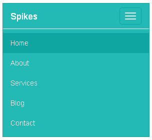
This same navbar will look collapsed like this in the mobile view.
 |
| Bootstrap Navbar Collapsed in Mobile View |
Since the bootstrap navbars are toggleable, by clicking on the top-right toggle button, you can expand the navbar and access the menu items like this.
 |
| Bootstrap Navbar Expanded in Mobile View |
Add Logo to Bootstrap Navbar
To add logo in the navbar header use this code,
<a class="navbar-brand" href="#"><img src="logo.png" alt="logo" /></a>
In case you want to override the existing navbar element say "navbar-default", then replace "navbar-new" with "navbar-default" everywhere in the code and you can easily change the look and feel of the default navbar in bootstrap.
Read Also:I hope now you have a pretty good idea to customize bootstrap navbar component.


You ROCK! I was having a heck of a time but your code works perfect. Thanks so much!
ReplyDeleteGlad it helped you... Cheers:)
DeletePretty good I just stumbled upon your blog and wanted to say that I have really enjoyed reading your blog posts. Any way I'll be subscribing to your feed and I hope you post again soon. Big thanks for the useful info. bootstrap templates
ReplyDeleteHi! Glad you liked my blog and thanks for your support:)
DeleteHello, I'm copying your example exactly how it is but on my test HTML page the menu is always collapsed. I haven't been able to find what can be the problem.
ReplyDeleteI'm copying this example exactly how it was published but on my HTML test page the menu is always collapsed. I haven't been able to find what is causing this.
ReplyDeleteHey! If you view the menu in desktop you can see it in normal view. If it is of tablet/mobile, menubar will be collapsed. Bootstrap is responsive in nature and the menu will be collapsed if the view port resolution is anything below 768×1024 px. You can easily test it with your browser's 'web developer' tool. It contains 'responsive view design'. Just check with it. This tool is availale for both chrome/firefox browsers.
DeleteCheers!